About the Business
BFC is a local fast-food brand that people already know and trust.
They serve everyday comfort food and are part of the local food culture.
The brand didn’t need to become something new.
It needed to feel more clear, more consistent, and more confident as it grows.
This project was about refining the brand, not changing its identity.
The Challenge
BFC’s visuals were loud and inconsistent.
Different layouts, too many styles, and no clear system.
Other fast-food brands around them were very chaotic and noisy.
So BFC was getting lost instead of standing out.
The challenge was:
Keep the brand familiar
Make it look more clean and modern
Build trust through design
Avoid fast-food clichés
My Approach
Instead of redesigning everything from scratch, I focused on refinement.
I asked:
What already works?
What feels trusted and familiar?
How can we simplify without making it boring?
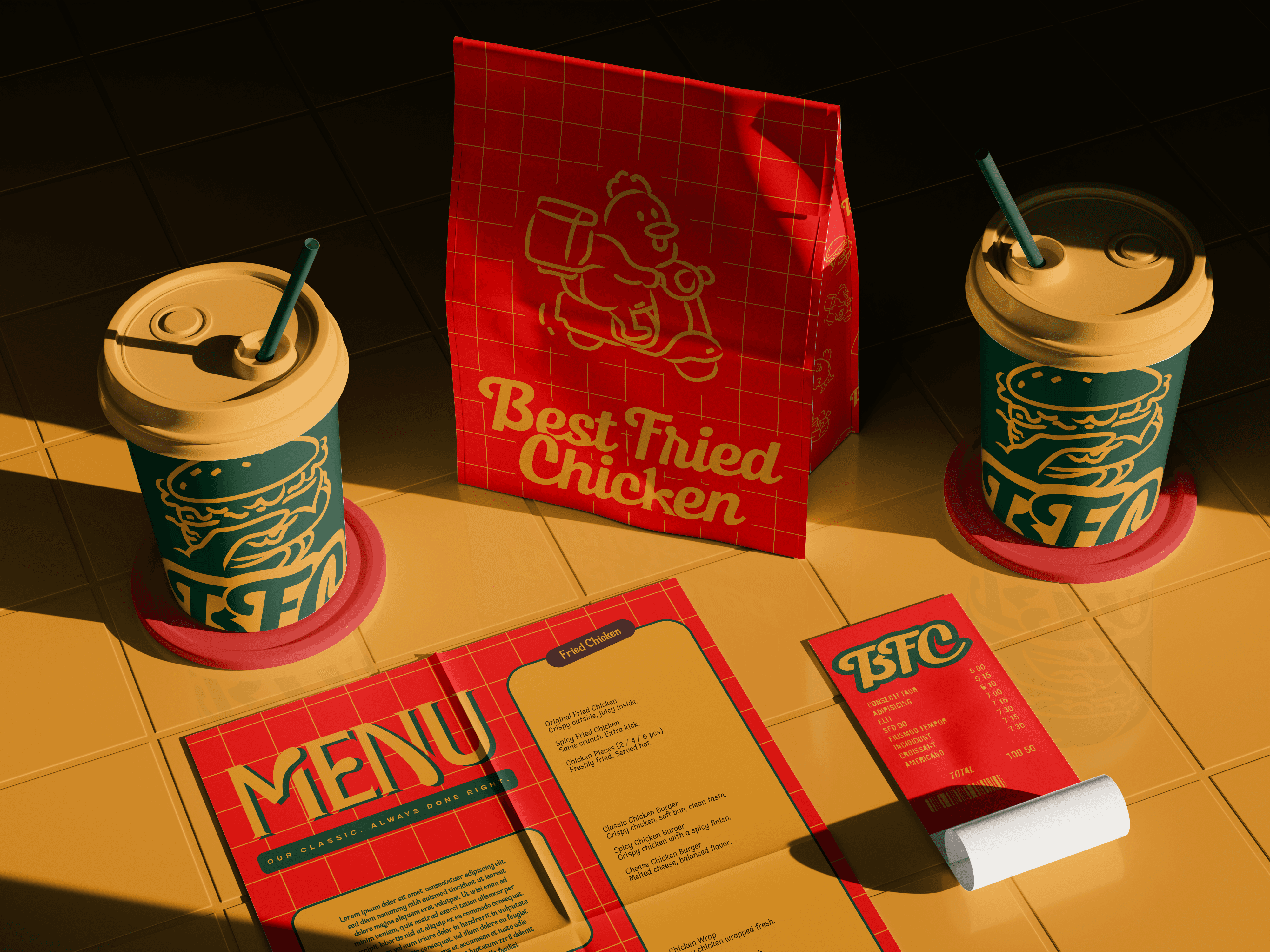
I chose a bright, structured direction so the brand feels confident, not loud.
Every decision was made to reduce visual noise and improve clarity.
Design Solutions
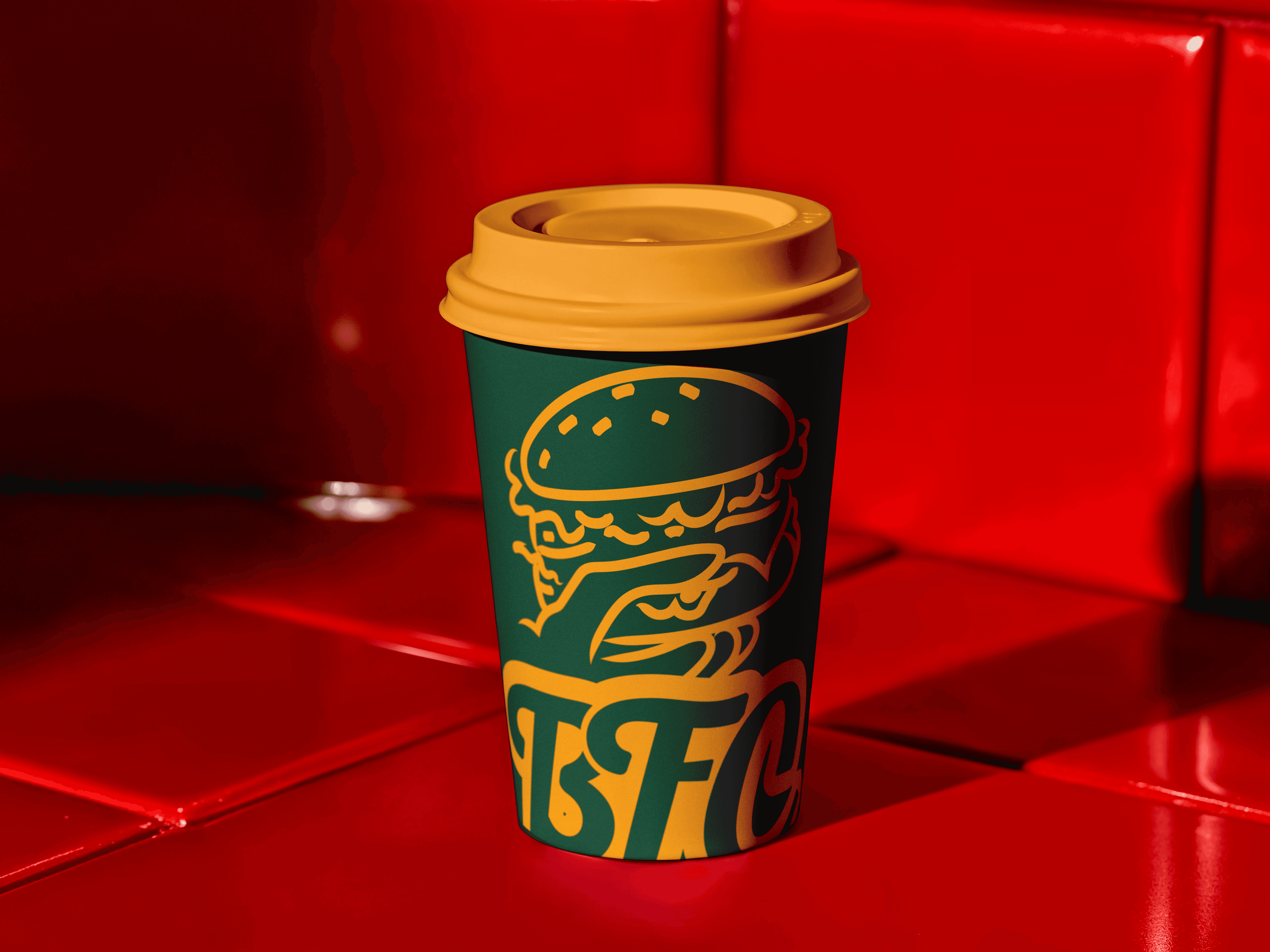
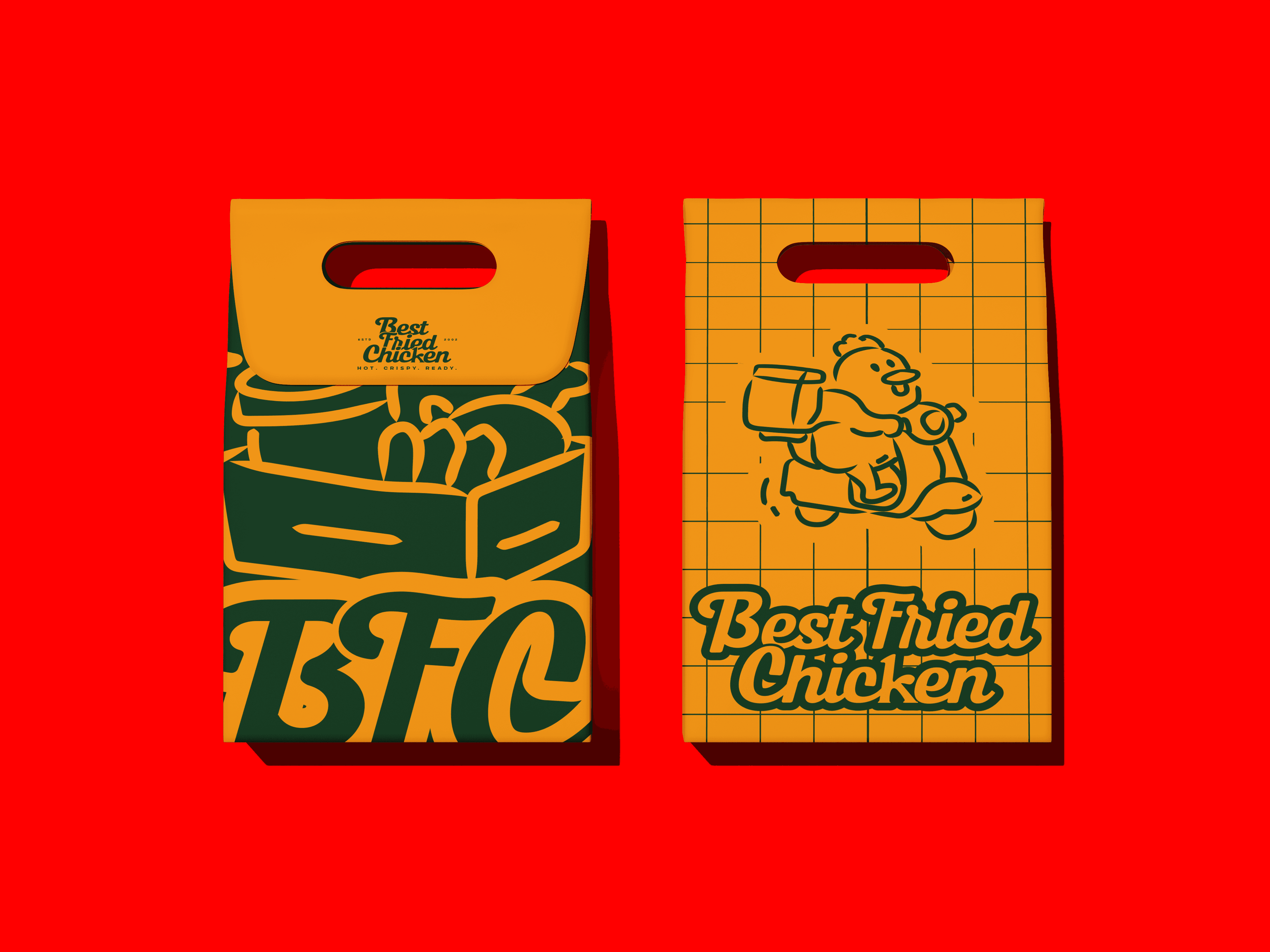
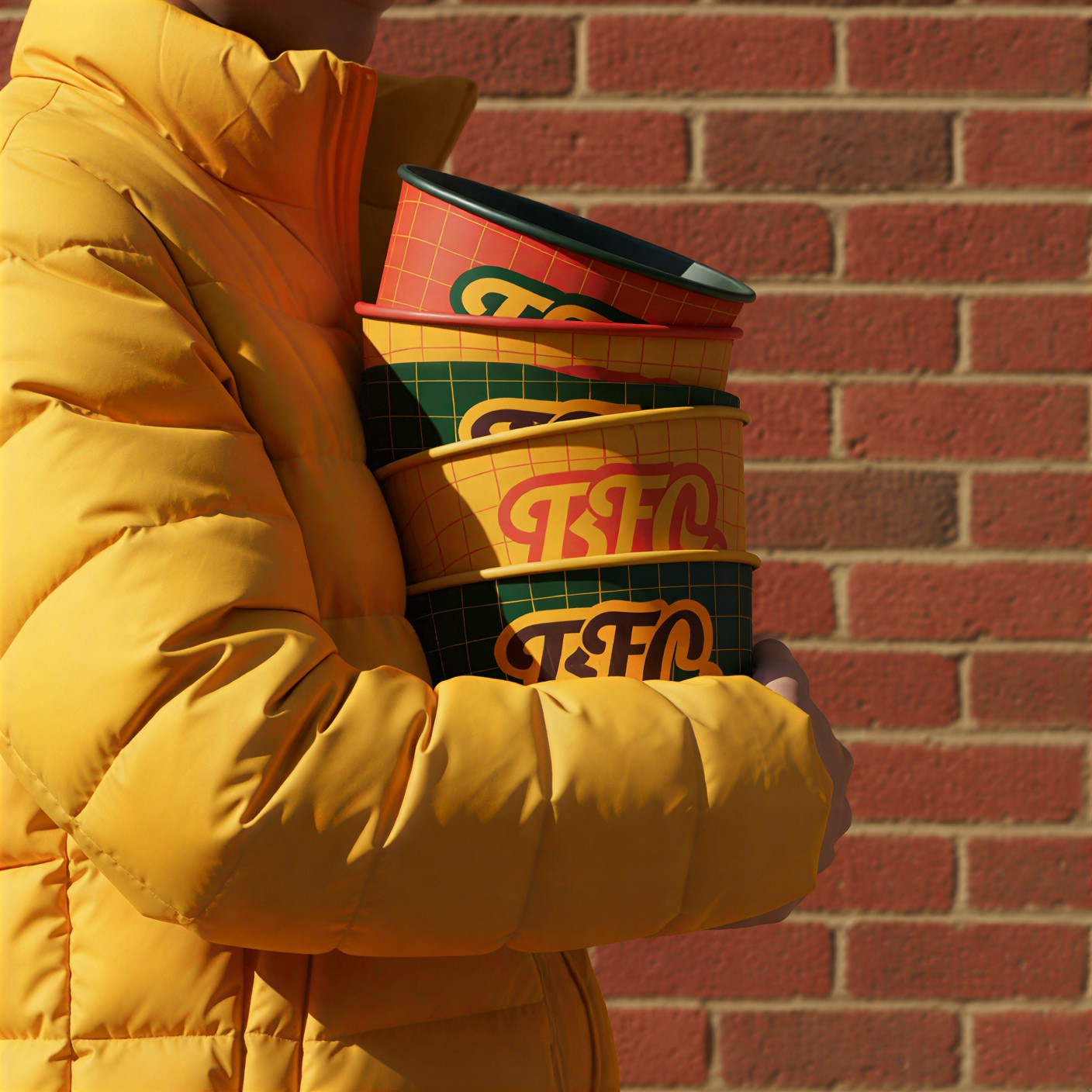
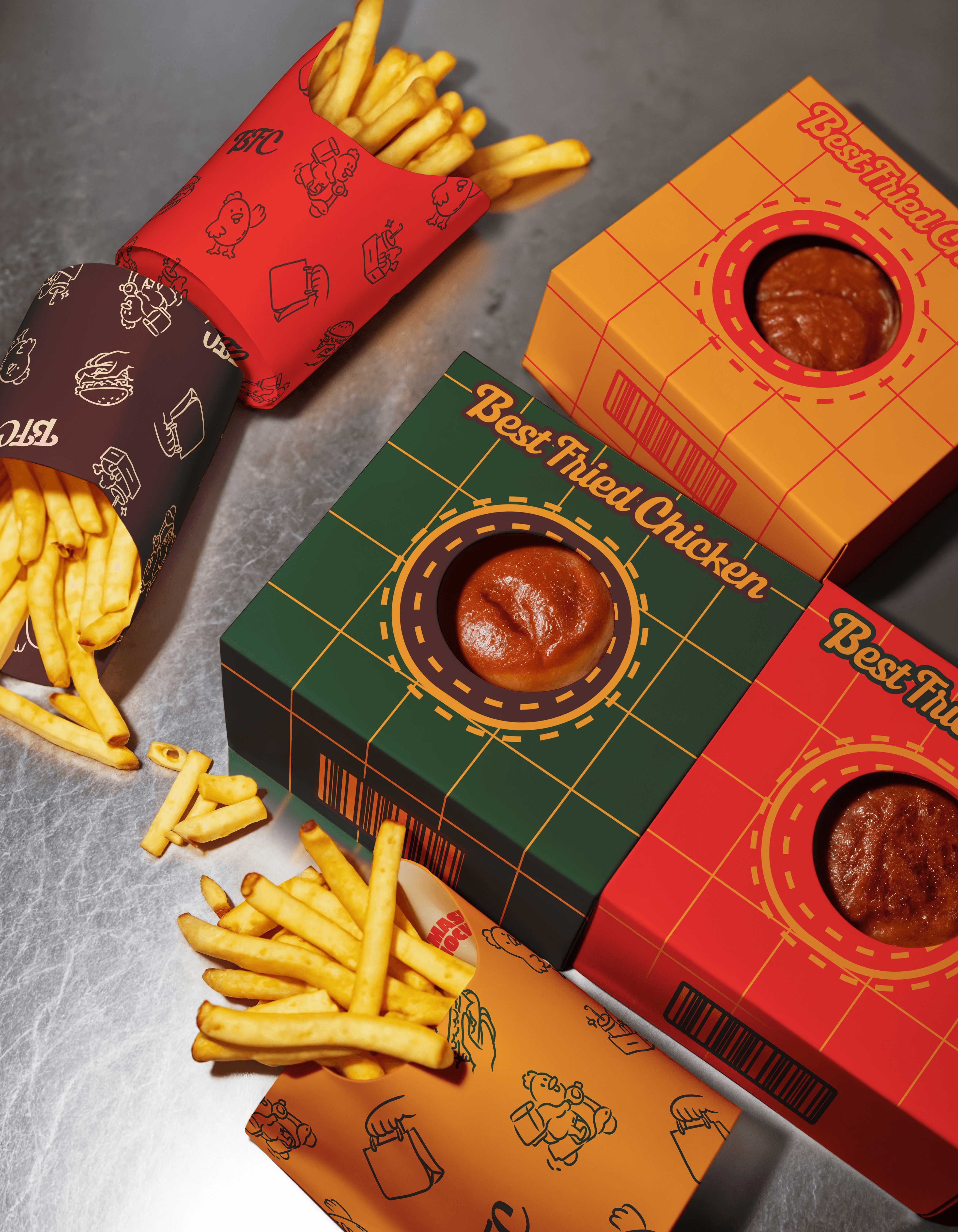
Clean and predictable layouts
Strong grid system used everywhere
Refined yellow and red color palette, with a few supporting colors
Rounded, friendly typography that feels modern but not sharp
Simple outline illustrations that feel human and approachable
Consistent icons, patterns, and spacing across all designs
The goal was to make everything feel organized, readable, and easy to trust.